
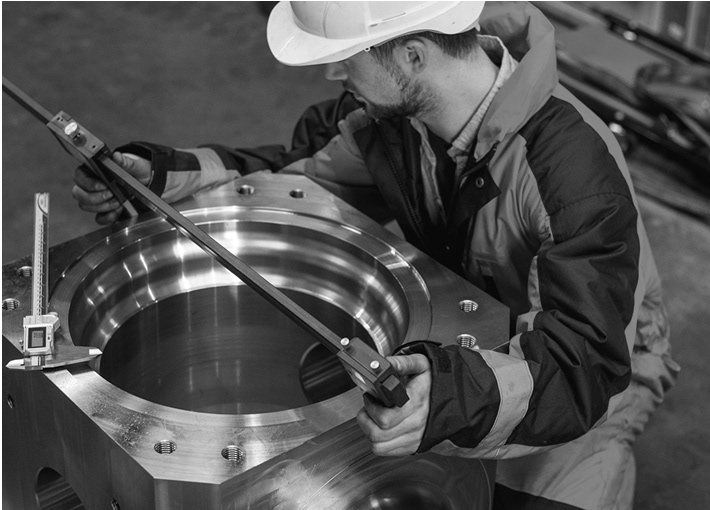
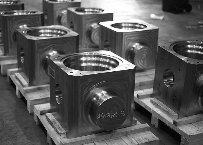
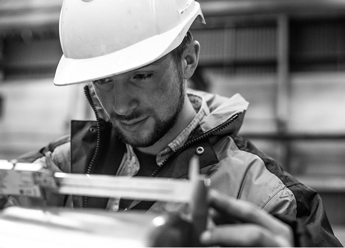
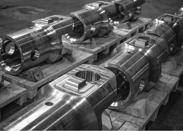
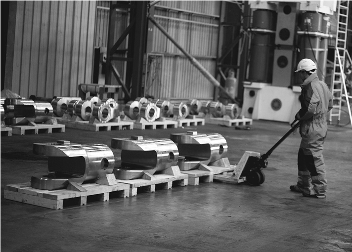
A no-nonsense brand built to perform in the world’s toughest environment


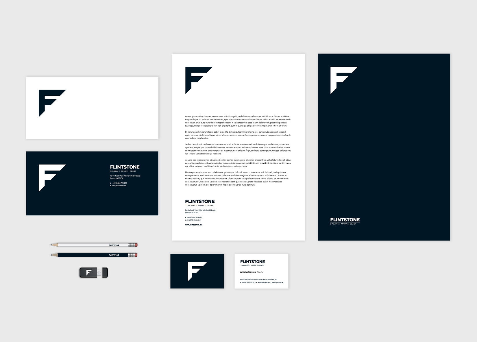
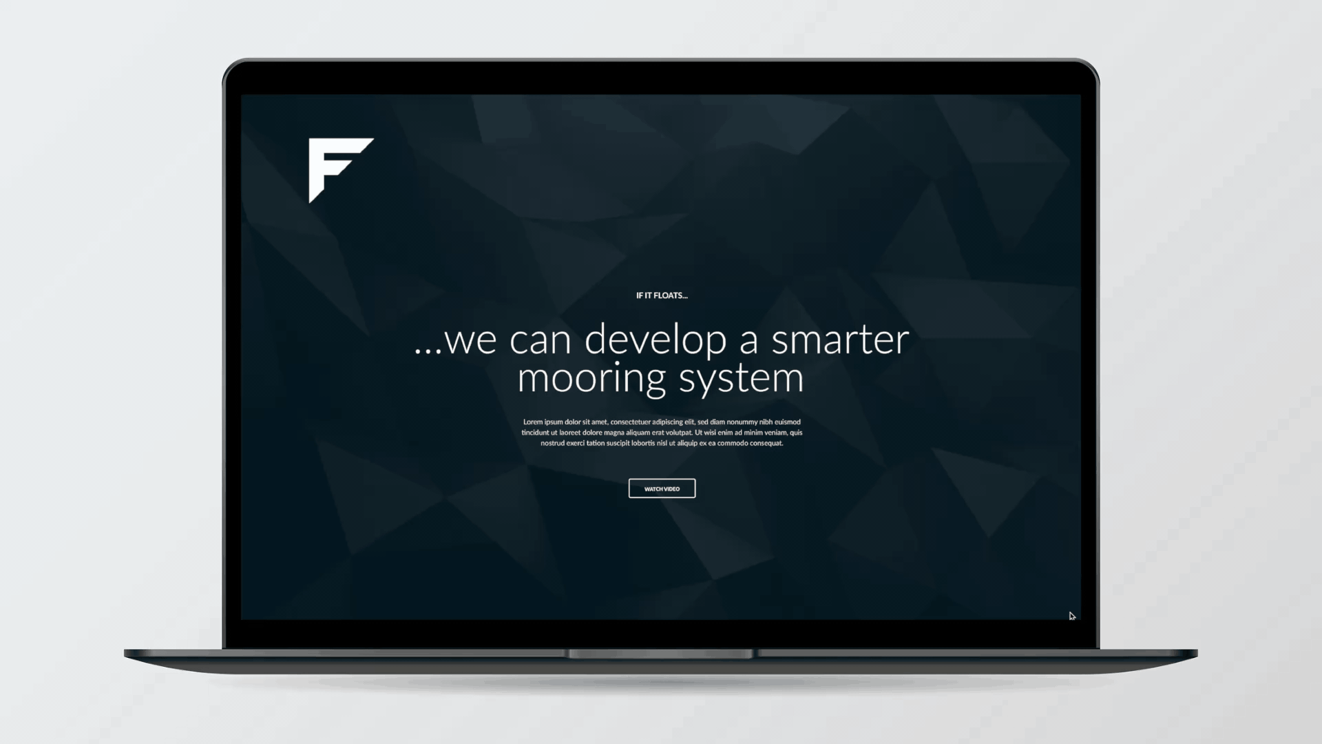
Flintstone needed more than a logo — they needed a visual identity that reflected their practical, solution-driven approach to offshore engineering. We created a bold, purposeful brand rooted in strength, clarity, and real-world reliability.
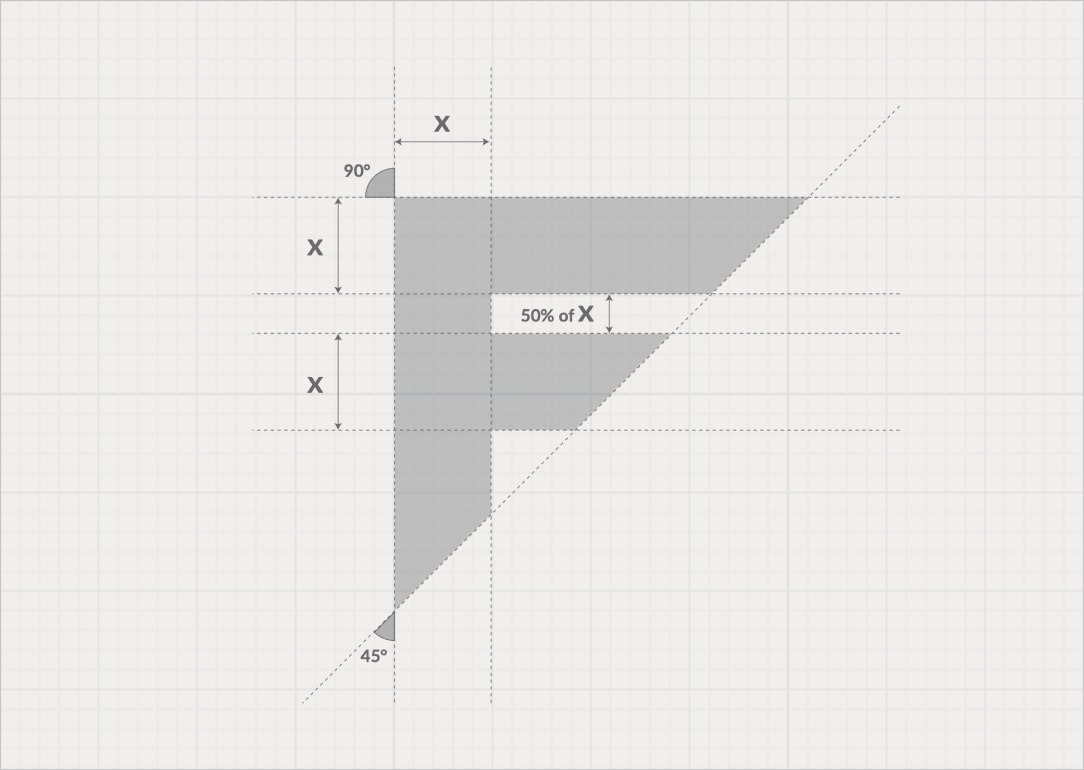
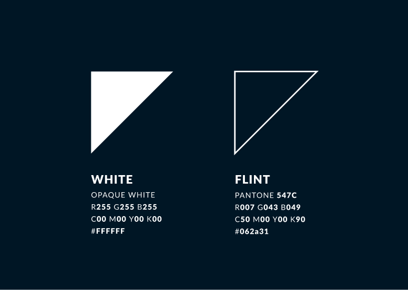
At the core of the identity is a custom stylised ‘F’ formed from thick, assertive strokes with a sharp angled cut. This simple, strong mark guides the eye forward, echoing Flintstone’s progressive, no-nonsense mindset. The restrained colour palette of muted neutrals reinforces a sense of control and technical precision, while typography combines strong, legible typefaces that balance professionalism with clarity.
Beyond the logo, this identity was brought to life across digital platforms and collateral. The bold visuals and clean structure enhanced Flintstone’s website and digital touchpoints, ensuring the brand’s confidence and clarity translated seamlessly online. The design balances technical detail with approachable clarity, helping communicate complex engineering solutions with confidence and ease.
Inspired by flint — a material known for its toughness and role in sparking fire and forging tools — the identity captures the company’s grounded, engineered spirit. The result is a brand and digital presence ready to deliver reliable solutions in some of the most demanding offshore environments.