Redesigning a national campaign platform to boost engagement, accessibility, and long-term impact
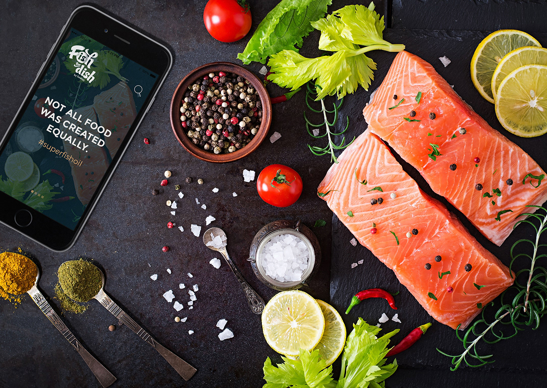
Fish is the Dish is a campaign by Seafish that promotes healthier, more sustainable seafood consumption in the UK. But the original website was outdated and underperforming. Engagement was low, the structure was unclear, and the mobile experience left users frustrated. The campaign needed a modern platform that made seafood feel easy, appealing, and accessible to a broad audience, especially busy families.
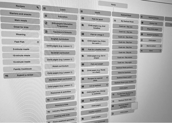
We started with research. Through surveys, stakeholder interviews, and usability testing, we uncovered the biggest friction points. Users struggled to find recipes, weren’t aware of the health benefits, and often gave up when browsing on mobile. These insights shaped the design strategy, which focused on improving content discoverability, simplifying navigation, and creating a warmer, more approachable visual identity.
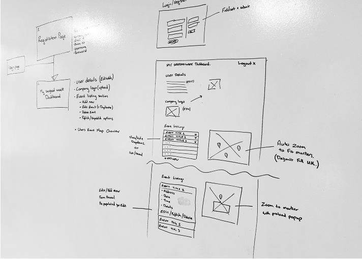
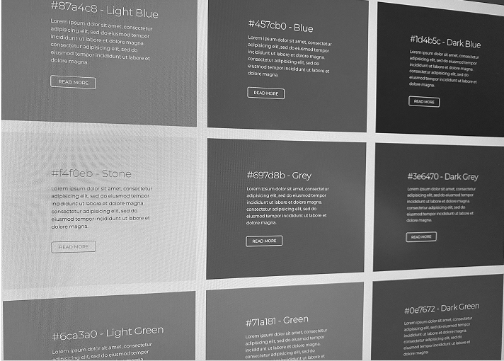
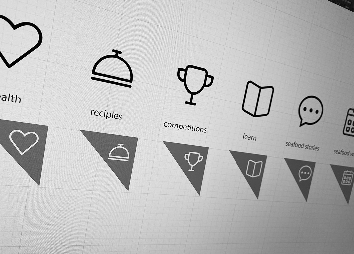
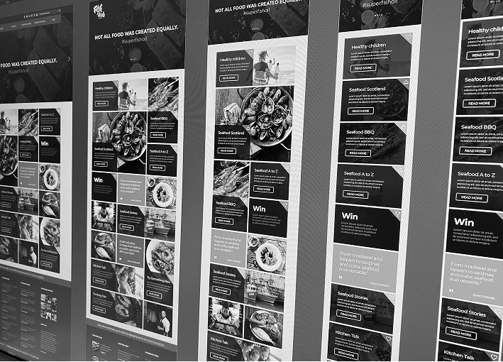
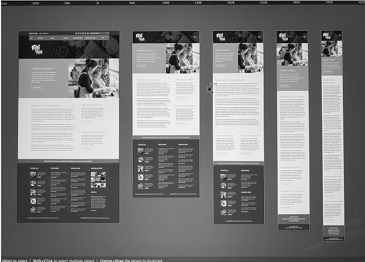
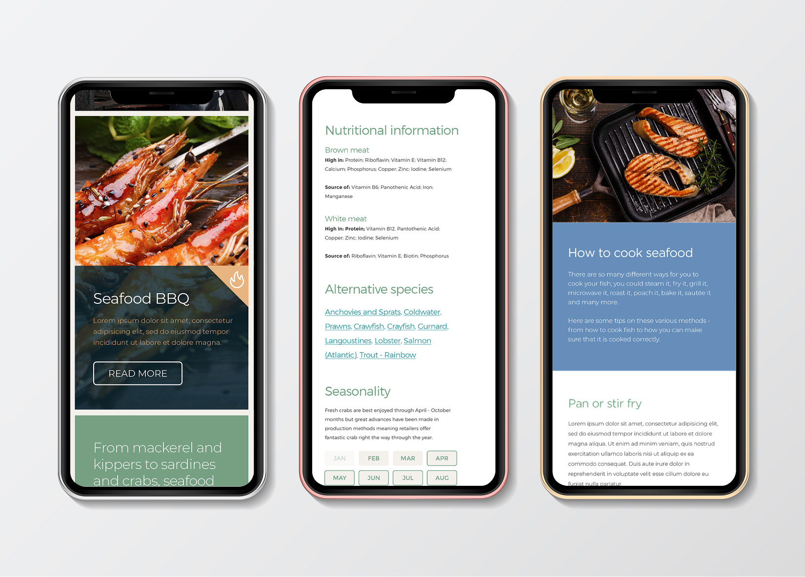
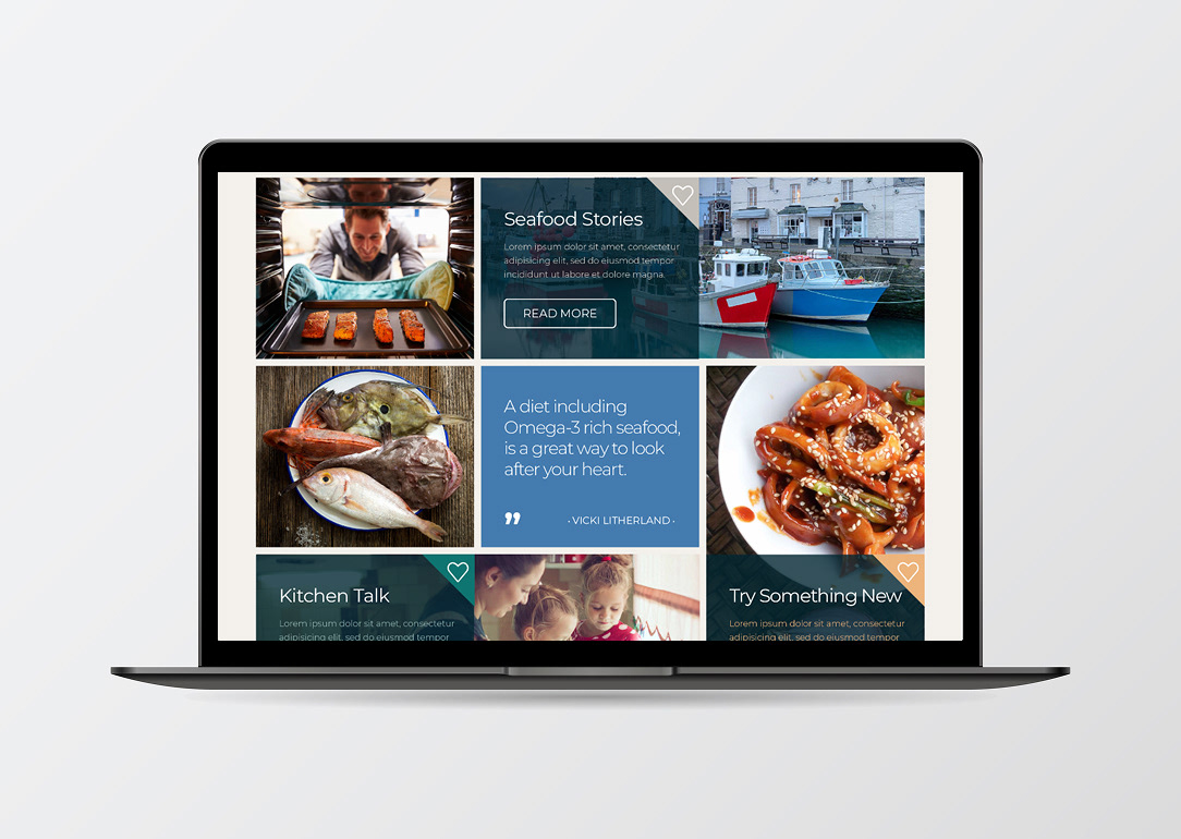
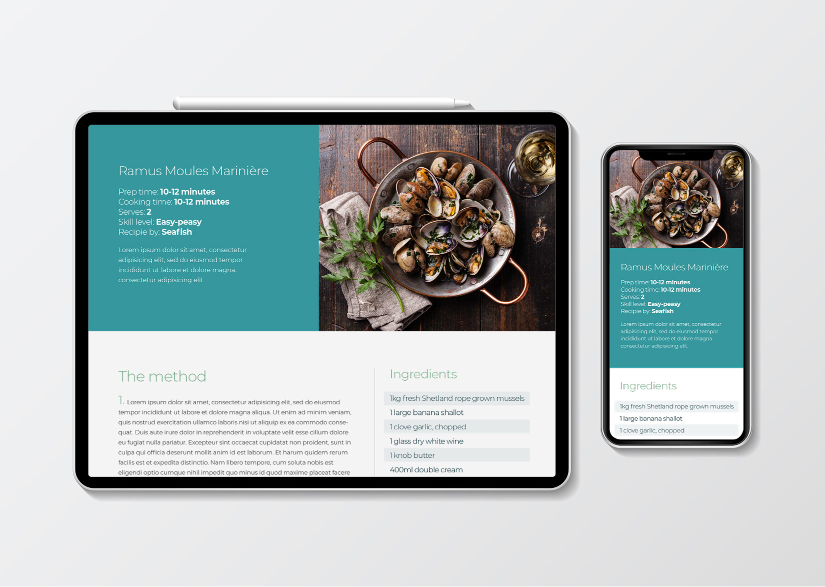
The new site was designed with a mobile-first mindset and a clear content hierarchy. Dynamic filters made recipes easier to search and explore, and visual cues helped guide users through the site. We introduced a fresh colour palette inspired by the sea, supported by vibrant food photography and accessible typography. Iconography and layout choices were made to feel both friendly and functional. I worked closely with developers throughout to ensure the final build stayed true to the design vision and performed well across all devices.
The results were clear. Time on page increased by 42 percent, mobile retention grew by 61 percent, and newsletter sign-ups rose by 38 percent. Internal teams also found it easier to manage and update content. The redesign gave the campaign a stronger platform to grow, while helping more people discover the benefits of seafood in a simple, engaging way.