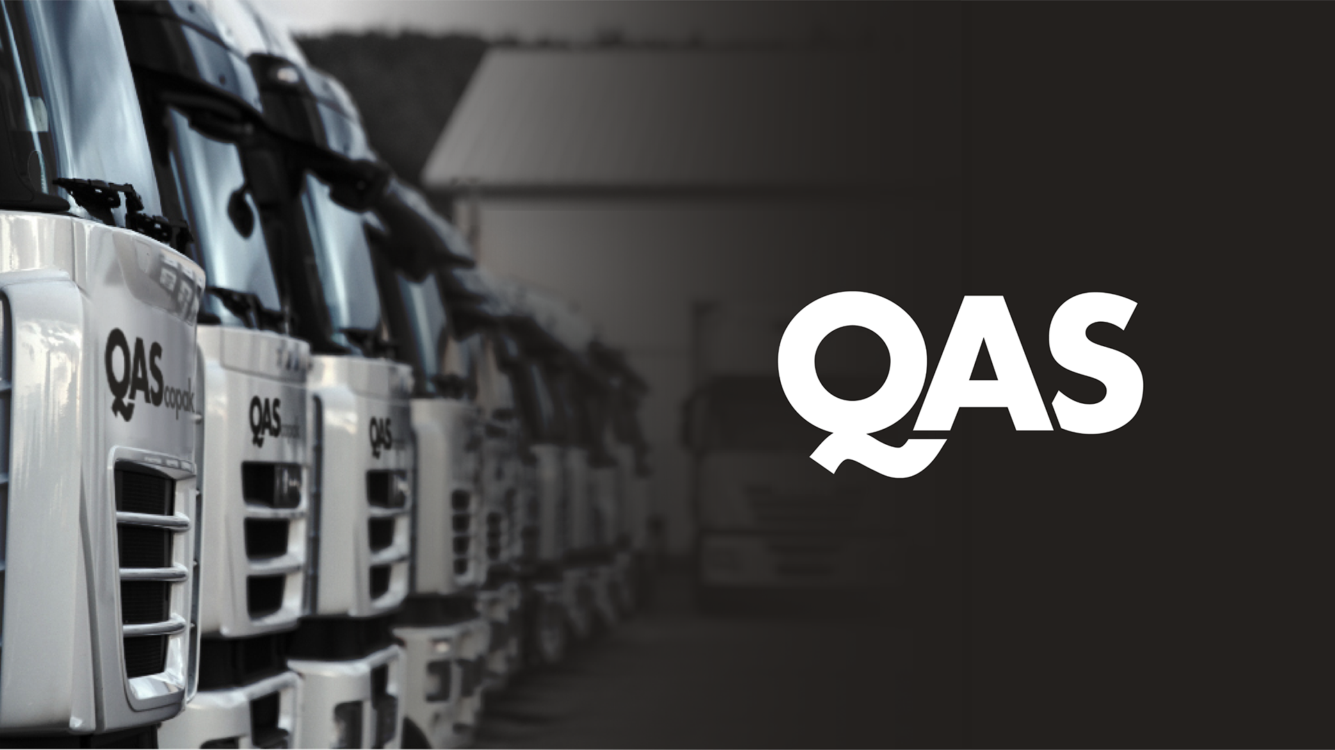
Packing precision into every pixel, branding expert assembly, storage, and logistic
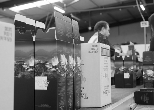
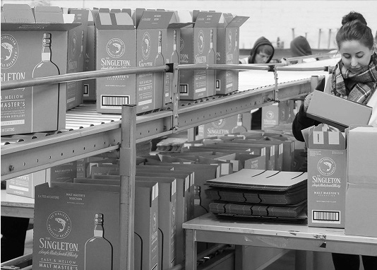
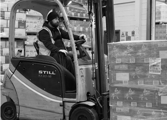
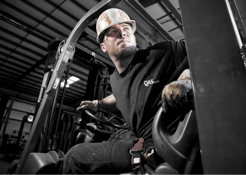
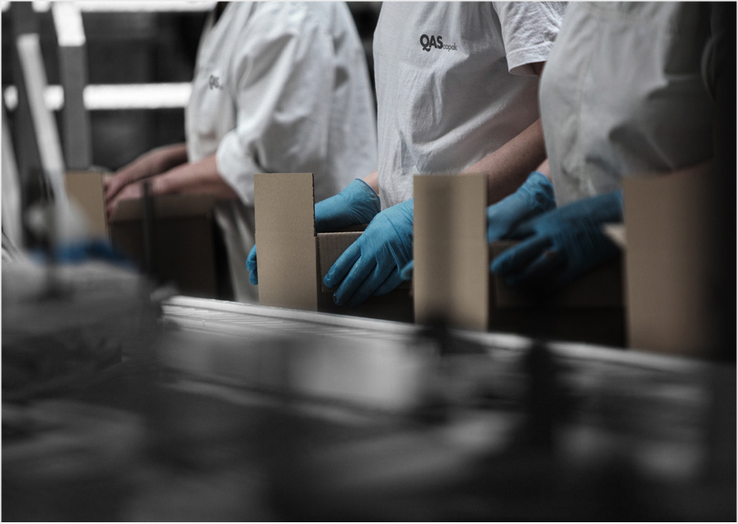
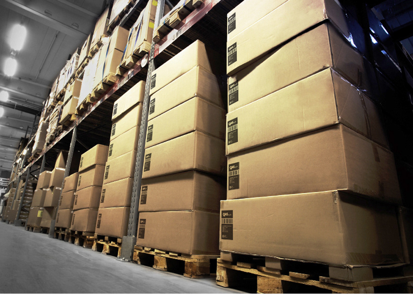
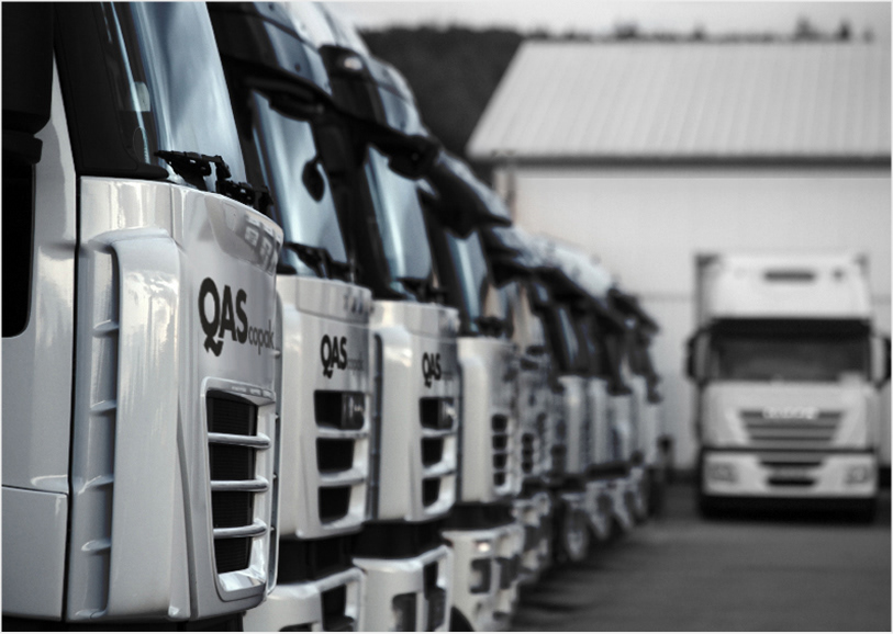
QAS delivers large-scale assembly, storage, and logistics services without ever losing focus on the individual client. We developed a bold, minimal identity grounded in connection, clarity, and control.
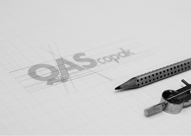
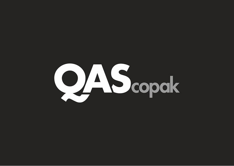
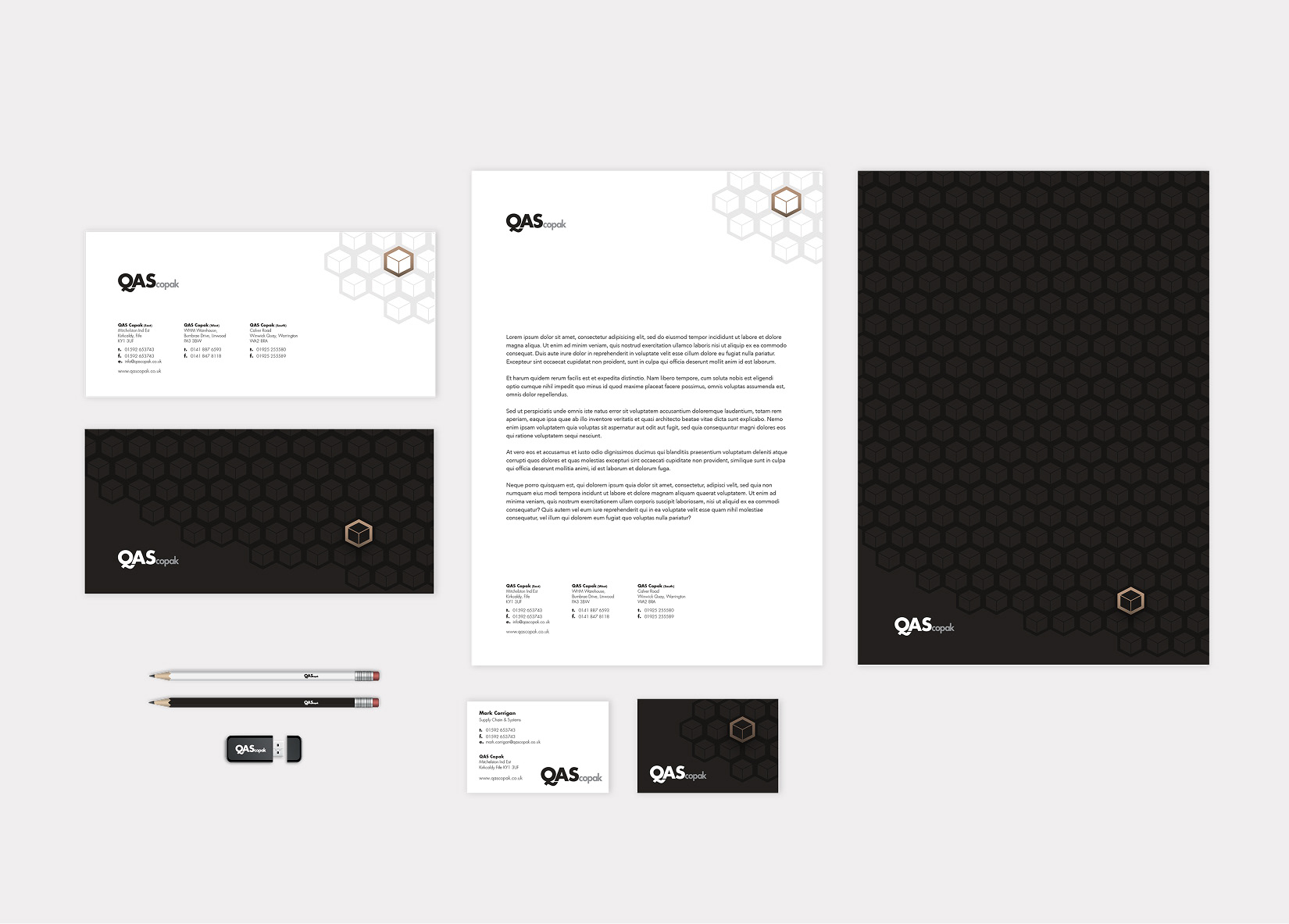
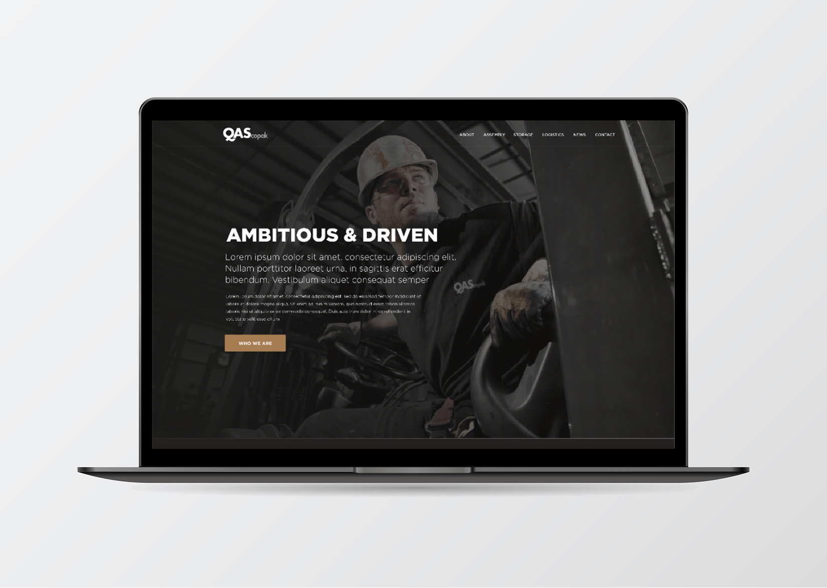
At the heart of the design is a customised logotype where the tail of the ‘Q’ flows seamlessly into the ‘A’, reflecting the integration and smooth flow that define QAS’s service model. Set in white on black, with “copak” highlighted in silver, the mark is striking yet minimal. It confidently expresses precision and reliability.
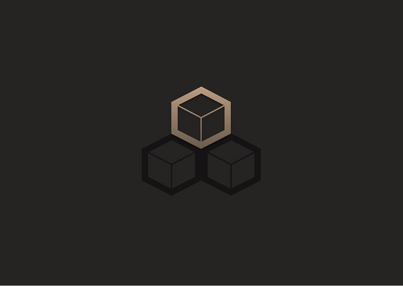
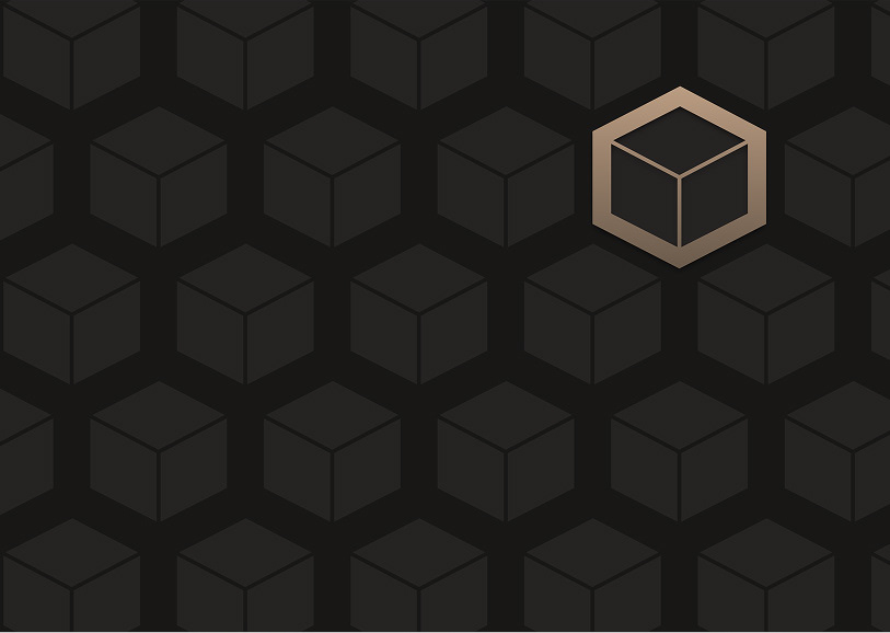
Supporting this is the modular cube system, representing QAS’s core services: assembly, storage, and logistics. Among a field of darkened cubes, one is always highlighted in copper to symbolise the client’s product. This clear visual cue reinforces that even within large-scale operations, individual focus remains paramount.
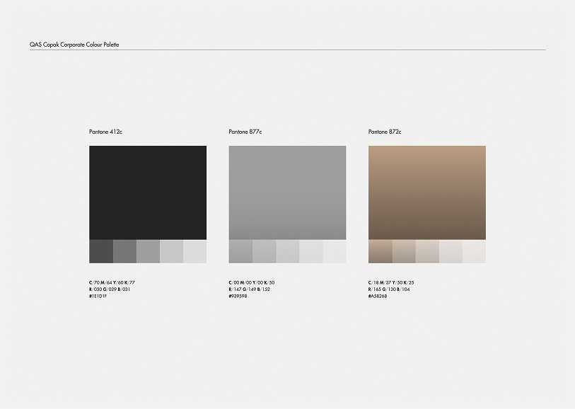
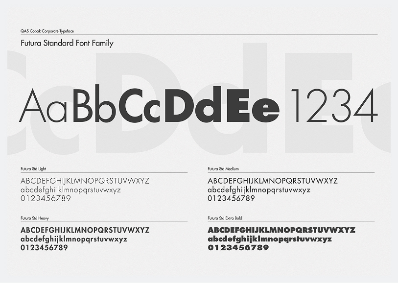
Typography uses Futura for its geometric clarity and modern utility, paired with a sharp monochrome palette and minimal metallic accents. The result is a clean, confident identity built for clarity and consistency across every brand touchpoint.